The basics
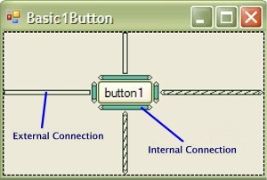
Each control you add to the Visual Studio designer is given four external connections that can be attached to the border of the form, other controls or special guide lines. There are also two internal connections that are used to maintain the width and height of the control. |
External Connection Properties EditorThe external connection properties can be edited by simply clicking on the connection.
|
Internal Connection Properties EditorInternal connection properties can be edited by clicking on the width or height connection
|
Connecting controls togetherControls can be connected together in order that they be aligned with one another. The connections are made by simply dragging the external connections onto controls or borders.
|
Guide linesHorizontal or vertical guides can be added to form to separate areas and to give the developer complete control over groups of controls without having to add nested user controls or panels.
|
Alignment GroupsControls can be grouped together into alignment groups. This unique feature lets you align or justify items without having to use restrictive grid layouts.
|
Vertical Alignment with springs
|
Vertical Guide
|
| Home / Features / Screen Shots / |
Rapid Layout Panel designer screen shots
Rapid Layout .NET lets a developer to connect user interface controls to other controls. The connections are displayed graphically in the Visual Studio designer. Developers can modify the connections by dragging or clicking on the graphical element.
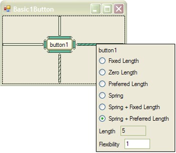 The length of the connection is specified as a fixed or preferred
length and an optional flexible spring. The fixed length is user specified and is usually set as normal by the developer dragging the control around on the designer. If preferred length is chosen then
the length will be a fixed natural spacing between that control and the item it is connected to. If a spring is chosen then rapid layout will allocate any available space amongst all the connected springs across the form.
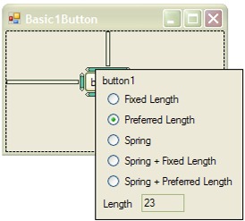 The width or height of the control is specified as a fixed or preferred length and an
optional flexible spring. The fixed length is user specified and is set as normal by the developer dragging the selection handles to size the control. If a preferred
length is chosen then the controls preferred width or height will be used. If a spring is chosen then rapid layout will allocate any available space amongst all the connected springs across the form.
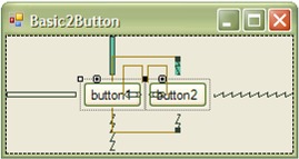 This shows two buttons that are connected. The right side of button1 is connected
to the left side of button2 and vise versa with a preferred length. The top of button2 is connected to the top of button1 with a spring. The bottom of button2 is
connected to the bottom of button1 with a spring. As a result button2 will now follow button1 wherever it is dragged on the form. If button2 is dragged then
because it is permanently attached to button1 then button1 will also move with it. As a button has a default 3 pixel margin then the spacing between the two buttons will be 6 pixels unless you change the margins.
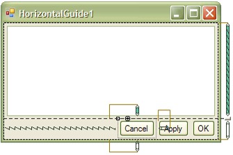 The top of each button here is connected to the horizontal guide and
the bottom is connected to the bottom border. The left and right of sides of the buttons are connected together in a chain with a preferred length to the right and a spring to the left. The top of the form has a
pane that has a internal springs and preferred length to the borders of the form. This way the pane will resize with form and the perfectly spaced buttons will always be aligned with the bottom right hand corner
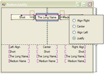 Here we see three buttons that have been put into an
alignment group with the purple grouping lines. The group has been has been defined as a justify group. This means that all the buttons will have the width of the largest button in the group. If you change the text
of the buttons they will automatically resize to the largest button. To group items the user simply clicks on the width internal connection and drags it onto another control in the group. The screen shot also shows three
other alignment groups of labels that have been left aligned, centered and right aligned.
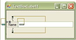 Shown here is a label that is permanently attached to the textbox to its right. It is
vertically aligned with the textbox by connecting the top and bottom of the label to the corresponding top and bottom of the textbox. These connections are set to springs in order to maintain the vertical alignment.
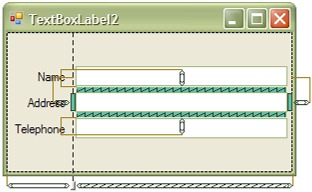 Shown here is a form logically separated by a vertical guide. There are three textboxes on the right with their corresponding labels on the left. Unlike a
grid layout or an nested user control it is still possible to vertically align the labels across the form regions in order that they be aligned properly with the
textboxes. Everything will remain aligned regardless of font style, language or form size.